
Posted: 2017-06-12 11:12:29
If you have ever asked yourself 'should I have a mobile website' then all I can say is have you used any public transport recently?
Because if you had you will have noticed that almost all of the people below the age of about 35 have their attention totally captivated by their mobile phone.
In fact you might have noticed something similar the last time you went into a restaurant during the day, or even in the street.
You might have noticed your partner or friends spending far too much time looking at their phone, so much so there is even a word for this - phubbing.
Perhaps you noticed none of this because you were reading stuff on your phone.
The penetration of the smartphone into daily life has become almost universal with only highly committed technophobes excluded.
According to a Google Consumer Barometer report in 2016, smartphone usage is now above 70 percent. So if you want to target the majority of the population it is important to have a mobile view.
To be clear, this percentage is likely to be the more economically active part of the population and includes both consumer and business users. The time when you might say that there was a difference in use between the two has gone. You are now as likely to find a business user researching new machines on their mobile as a consumer looking for a new TV.
The same Google source quoted 61% of customers who visit a mobile unfriendly website as being likely to go to a competitor's site, with 45% discouraged from returning to the non-mobile site again. So yes it is long past the time when you should be taking this stuff seriously.
Mobile friendly means that the user experience is appropriate to the device. On a desktop we have a large screen and a mouse, on a mobile we have a small screen and a finger. You cannot navigate the website in the same way.
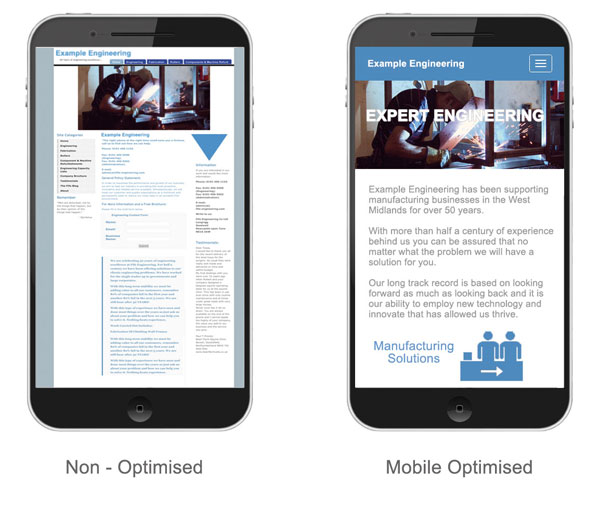
You may well have experienced this yourself looking at a non-optimised website on a phone. Yes you can view the whole website, but the text and images are very small and you need to pinch and scroll to read anything.
It is also likely you have waited a long time only to be disappointed. In the figure below you can see an example of how different the view is between the non-optmised and optimised versions. The view on the left will take quite a bit of effort to read, while the view on the right is fully accessible on the mobile device.
Responsive design means the website is put into a structure that 'resoponds' to the design it is being viewed on and reforms accordingly. So the view you get will be slightly different between a desktop and a laptop and significantly different on a tablet or smartphone. This technology offers the significant advantage of having one website that can be used well on pretty much every device.
A recent Google benchmark study found usability and speed are essential components for a good user experience on mobile. The study revealed that a fast page load of under 2 seconds was essential for a good user experience.
On a fully mobile optimised website large content such as images are dropped so the page loads faster and the text and menus are re-formed to make the text easy to read and navigate. This can also mean that content is truncated and code rich components such as slide shows are either dropped or never there in the first place.
Some of the figures provided by Google seem to be intent on driving everyone towards their new Accelerated Mobile Pages. This technology would require a dedicated set of mobile pages rather than responsive ones. This may be a good idea if you have plenty of resources (ie cash) for design and upkeep, but in some ways it is a step back to the world of mobile before the concept of responsive design entered the market.
It is mostly the resource rich larger businesses that are going with this new idea, which is an opportunity for many smaller businesses to steal a march on their competition. However there may come a time in the future when the power of devices and the ubiquity of 4G & 5G is enough to make them redundant. To be clear, we are not there yet.
The advent of Accelerated Mobile Pages was not envisaged when I wrote the first version of this article back in 2012. Back then it was all about getting the word out about responsive design and encouraging the B2B market especially to start to take this stuff seriously.
I did not envisage then that so many businesses would still be dragging their feet over upgrading their website in 2017 and failing to present themselves effectively where their customers are - ie on every type of device including mobile.
We are in the future now - technology is everywhere, users are becoming more and more savvy and the landscape changes monthly - its time to respond and do it now.
Mobile is here to stay and will only become more and more important, so the time for action is now. If you have any doubts about this, get an independent view on your website first by going to : Google site testing.
This tool will cost you nothing at all, but will allow you to see how Google views your website and decide where to go from there.
Next, discuss options - get in touch and see what can be done within the budget you have.
The initial consultation is without obligation and will also cost you nothing. Why not ask TTMG Internet now about mobile website development?